Rectangle (tetradic) color scheme
The rectangle or tetradic color scheme uses four colors arranged into two complementary pairs. This rich color scheme offers plenty of possibilities for variation. Tetradic color schemes works best if you let one color be dominant. You should also pay attention to the balance between warm and cool colors in your design.
Read More.....................
Square color scheme
The square color scheme is similar to the rectangle, but with all four colors spaced evenly around the color circle. Square color schemes works best if you let one color be dominant. You should also pay attention to the balance between warm and cool colors in your design.
A color scheme can help establish the mood, tone and emotion of a room through effective use and balance of color. The color of a room can affect the attitude of its occupant. Picking color schemes which set the tone or mood for a room will help transform a dull room with no synergy into a work of art.
Read More.........................
Split-Complementary
The split-complementary color scheme is a variation of the complementary color scheme. In addition to the base color, it uses the two colors adjacent to its complement.
This color scheme has the same strong visual contrast as the complementary color scheme, but has less tension. The split-complimentary color scheme is often a good choice for beginners, because it is difficult to mess up.
Read More...................
Triadic color scheme
A triadic color scheme uses colors that are evenly spaced around the color wheel. Triadic color schemes tend to be quite vibrant, even if you use pale or unsaturated versions of your hues.
To use a triadic harmony successfully, the colors should be carefully balanced – let one color dominate and use the two others for accent.
Read More...............
Analogous color schemes use colors that are next to each other on the color wheel. They usually match well and create serene and comfortable designs. Analogous color schemes are often found in nature and are harmonious and pleasing to the eye.
Make sure you have enough contrast when choosing an analogous color scheme. Choose one color to dominate, a second to support. The third color is used (along with black, white or gray) as an accent.
Read More....................
Complementary color scheme
Colors that are opposite each other on the color wheel are considered to be complementary colors (example: red and green).
The high contrast of complementary colors creates a vibrant look especially when used at full saturation. This color scheme must be managed well so it is not jarring. Complementary color schemes are tricky to use in large doses, but work well when you want.
Read More
Accent walls can make a board buoy alter the balance, mood, and the scale of how that experience in space. Previously, accent walls a bold color mark or free for the main color of a room.
These accent wall suction tends to draw your eye to a main axis, and apart from the loamy sand.
Read More........................
The benefit of staying within a neutral color range with your paint color within your bedroom is that you can always vamp things up a bit by adding a bolder color to your floor with a rug, or to the entire room with bolder bedding.
Neutral colors, while soothing and great for creating the atmosphere for relaxation, are the most versatile when it comes to decorating your bedroom.
Read More.....................
Paint or wallpaper one wall in your bedroom a brighter color than the others. This accent wall will make your bedroom look more interesting. Wallpapers are available in practically any texture and color you can imagine, so have fun shopping around.
If you have an old dresser you’re using somewhere in your house that isn’t very attractive consider giving it a makeover. Sand it down and paint it a bright color or stain.
Read More.............................
When designing a kitchen, we cannot stress enough the importance of color. Many people are scared of color (are you?). Many homeowners feel white is the best option, and an off white is a daring choice. Color is great, and it is especially important to think about during your kitchen remodel.
You want a color that accents your cabinets and your new amenities but doesn't drown out the kitchen. We suggest picking up a color that is subdued enough to let your new kitchen shine then painting one wall as an accent wall for even more interest.
Read More................
I
f the design of your space is perfect for an accent wall, use color and be creative. You can paint the wall one single color, or you can add a painted patterned wall with a variety of hues, a stencil or hand-painted design. Wallpaper is a good choice as well because it allows you to have a luxury wall covering without digging too deep in your wallet.
Read More.................
To properly implement the accent wall inside the house here are some excellent tips to walk you through.
1. When deciding which wall to use, choose the first one you see when entering the house or the room.
2. Use accent wall decors to define or separate a distinct area from a bigger space. This is perfect for open plan houses to characterize the living area, the dining, reading area etc.
3. There are usually two implementations of accent walls. In most cases, accent wall is a bold color against neutral walls. The other version is using a more dominant color against other wall of the same hue.
Read More.....................
This is one more good interior option. A light colored wall with contrasting colored outlines is a nice idea. Here pale yellow and brown colors are used, you can opt for a color of your choice. Nice light shaded curtains add more grace to the office.
Read More....................
Office is an important place of everybody’s life. Everyone spends a quality time of our days in the office. In such a case a cool, refreshing office interior has its own much importance. Simple dull colors and boring color in the office may make the workers feel bored. A bored worker on the other hand affects the whole working of the office. So if you want your workers to work properly and nicely, then you have to work on some great interior ideas.
Bright colors in the office increase the concentration level of the workers. Red is a bright color and when mixed with contrasting colors properly gives amazing results. White and red walls with textures give a nice impact. White and red cabinets also make the working place a happening one.
Read More......................
For those of you, whose employees are doing something creative such as writing, stimulating and inspiring colors, like yellow and light orange are perfect.
These colors enhance creativity and imagination and keep a person energetic throughout the day. If you have a small office, you can paint the wall background in some light color and have designs on it in these bright colors. One caution here - do not overuse yellow as it can sometimes create an overwhelming effect on the room surroundings.
Read More..........
Green indoor plants is one of the cheapest and easiest bedroom decorating ideas that add a splash of green color and make modern bedroom designs look eco friendly and beautiful. Small indoor plants are great room decor accessories for a child bedroom, guest bedroom or master bedroom designs.
Indoor plants offer pleasant, inexpensive and healthy bedroom decorating ideas year around. Taking care of house plants and watching them grow produce a strong positive effect on people.
Read More...............
Green color is the mix of yellow and blue hues, the combination that is associated with static and stillness in human brain perception. Human eyes relax looking at green room decor accessories, green wallpaper patterns or wall paint colors.
Light green color shades help fight claustrophobia and great for small bedroom designs. If you feel uncomfortable with your small bedroom, if you do not like your low ceiling or narrow bedroom designs, use green room decor accessories, light green furniture and wall paint colors or beautiful green wallpapers for relief.
Read More.......................
We seek to heal ourselves physically, mentally, emotionally and spiritually. We strive to keep our bodies and psyches in balance. Color can be a powerful provider of guidance and insight that helps us achieve that balance.
The health-giving properties of color, in food as well as the environment, have long been acknowledged. Colored lighting, color therapy and color in health-care settings are all critical areas for exploration and enlightenment.
Read More...................
Synthetic Enamels are alkyd resin based formulations that work equally well on wood, metal and even walls. Besides a brilliant and smooth finish, they also provide very good protection against atmospheric corrosion, including rusting.
Premium Enamels are extremely tough, provide long protection and mirror-like finish. They withstand extereme climatic changes and can be used both inside and outside.
Read More..................
General Purpose Enamels are also tough, provide a durable and pleasing, though less glossy finish. They are not recommended for exterior surfaces.
Two coats of a general purpose enamel give good long term protection for hardworking surfaces where durability and economy are chiefly wanted.
Read More.................
Decorating director office with the modern design ideas, Director room is designed with a very modern and elegant with a dark brown color and a very harmonious mix of colors, the room is designed very luxurious director and designed the light so that your work is not saturated.
Read More..................
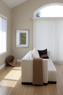
We can do many things to get an comfortable living room, like soothing the living room with blue color palette so the living room looks fresh and comfortable.
The other thing you can do is nestle two leather sofas near a cozy fire place then to get a pop room just give a melon and crisp white color palette. You may also make a great living room with nature’s color palette without the typical log cabin feel. Add a home theater also proves an enviable space, a massive space, turns cozy and inviting with the addition of carefully selected furniture.
Read More..............
Wall colors make huge visual surfaces, that's why it's good when they're toned or shaded. Toned means: having bits of color added to them. If you're a bit adventurous, and don't like the color you bought because it's too one-sided: add colors to it to make the color more subtle.
Shaded color means: to combine darker and lighter neighbor-colors (like: orangish red and brownish red etc). By using shaded colors, you can play with the light in the room.
Read More...........
You can paint one wall of your living room with a bold color and make this wall the focal point of the room. If you choose any contrast color for the rest walls of the room, then it will give a tempting look to your living room.
Avoid monotonous atmosphere of the living room by adding a few notes of energetic colors such as green or cobalt blue if you are using white color for decorating whole room.
Never apply dark colors of paint for small rooms as they make the rooms look smaller
Read More................
The colors you choose are up to you, but just remember the old 60-30-10 rule: 60 percent should be a dominant color, 30 percent should be a secondary color (typically the furniture color), and 10 percent should be an accent color.
We looked around the net and came up with a list of best paint colors for every room in your house. If you’re looking for some color tools to play around with, try this site.
Read More.............
The colors you choose are up to you, but just remember the old 60-30-10 rule: 60 percent should be a dominant color, 30 percent should be a secondary color (typically the furniture color), and 10 percent should be an accent color.
Read More...........
Although some people are moving away from beige and brown paint in favor of gray, these colors are still mainstays for those who love warm neutrals.
Earth tones will always have a special place in design because they are constant colors in nature and in our popular culture: lattes, espressos, khakis, chocolate, and even the UPS truck. These hues can be bold or bashful, and they fit easily into our homes. Here are some tips for picking the best brown paint color, from beige to almost black.
Read More........
A bathroom is often considered as a person’s private room and therefore needs special bathroom painting ideas to reflect this uniqueness. And one can get a lot of such bathroom ideas through various media. The main thing to consider is that the bathroom painting should be something that has your personality reflected in it.
Yellow bathroom remodeling ideas very interesting, color striking and suggest that light to make anyone interested. Yellow bathroom remodeling ideas reflects luxury yellow because the yellow symbolizes luxury. Yellow bathroom remodeling ideas can use the yellow tiles.
Read More..............
For those of you, whose employees are doing something creative such as writing, stimulating and inspiring colors, like yellow and light orange are perfect.
These colors enhance creativity and imagination and keep a person energetic throughout the day. If you have a small office, you can paint the wall background in some light color and have designs on it in these bright colors. One caution here - do not overuse yellow as it can sometimes create an overwhelming effect on the room surroundings.
Read More..........
T
his type of wall decor is presently one of the latest trend of home accents. It is basically a wall within a single room that is clearly detectable and more interesting than the other walls in the room.
More often, accent walls are painted with bright colors and ar typically highlighted with other fashionable home accents.
Read More........
Colors for a home office should be soothing but that doesn’t mean that they can’t be interesting. You can use a nature inspired color palette of taupes, grays and greens. Choose one piece of furniture in the room to give special attention to such as a plain filing cabinet or a desktop.
When working with these types of color palettes you’ll need to pay extra attention to what colors your office supplies are. You may need to stay away from brightly colored paper clips and desk accessories and instead use small metal urns and wicker baskets to store your supplies for a cohesive design.
Read More................
Choosing Paint Colors for Guest Room

Black, White and Green:
No matter how bold you go with color in your spaces. This guest bedroom suite found with a strong color statement. But it's the white and black that makes it livable.
Read More....................
It has been always found that color washing works extremely well with brighter colors, particularly yellows, oranges, and reds. Color washing with a white base coat and bright golden glaze can reproduce something of a sunny Tuscan or Provencal stucco finish.
French brushing always looks best when executed in a subtle color range. In this example, three colors of paint — a warm white, a light orange, and a medium orange — are applied over a coat of warm white latex.
Read More................
These colors can be found placed diametrically opposite each other on the Color Wheel.
They are in maximum contrast to each other.
Thus, each color stands out very brightly against its complementary counterpart. These colors can be used to create a very vibrant and bold look!
Read More................
We seek to heal ourselves physically, mentally, emotionally and spiritually. We strive to keep our bodies and psyches in balance. Color can be a powerful provider of guidance and insight that helps us achieve that balance.
The health-giving properties of color, in food as well as the environment, have long been acknowledged. Colored lighting, color therapy and color in health-care settings are all critical areas for exploration and enlightenment.
Whether proven by science or inspired by spiritual quest, encouraged by the power of suggestion or the result of deeply imbedded memories, there is no question that color's effects are imprinted indelibly within the human psyche and spirit.
Read More.............
A composition of light, medium and dark colors. You can see the tonal value of colors.
In a small, dark room, let light colors take the big surface, and dark ones are added as details (pillows, pictureframes, etc).
In bigger, lighter rooms, medium colors take up the big surface, and light colors make higlighted details.
Read More...............
Before being intimidated by the thought of lime green in the kitchen, just look at the picture here. A wall painted in beautiful color that contributes to the kitchen without actually falling too bright.
This is a great refreshing color, and when combined with simple wooden flower and white kitchen, he has toned down considerably to exhibit pure style. If you’re a little more adventurous, go ahead and get those lime green cabinets in the kitchen, and combine them with white or yellow, even for a really bright kitchen!
Read More............
Vivid yellow color is perfect for use in kitchen with plenty of sunshine. On the other hand, if your kitchen does not have enough sunlight, use it to bring in a burst of light that it needs.
Finally, if nothing else, use a shade of yellow to break the monotony of a single, dark color, as shown in the picture. It looks absolutely charming and radiant. If it seems too bright yellow for you, try a bright yellow in combination with a lighter neutral gray or even lime green.
Read more............
Brown: Although brown is often interpreted as a "soothing" color, it does not have the same effect that blues and greens do (these colors promote meditation, tranquility, and peace, which can actually slow down a workday). Brown, on the other hand, is more of a "comfortable" color that evokes feelings of security, credibility and reassurance.
Read More.........
We can do many things to get an comfortable living room, like soothing the livingroom with blue color palette so the living room looks fresh and comfortable.
The other thing you can do is nestle two leather sofas near a cozy fire place then to get a pop room just give a melon and crisp white color palette. You may also make a great living room with nature’s color palette without the typical log cabin feel. Add a home theater also proves an enviable space, a massive space, turns cozy and inviting with the addition of carefully selected furniture.
Read More..............
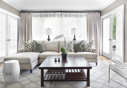
Here are a new living room decorating ideas. This living room decorate in a relax style, so it is also suit for your relaxing time with your family.
Not only that you can also get a comfortable feel while reading the book there. It is easy to make your living room or your central guest room to be like this. Just give the best wall decor, rugs,curtains, lighting, sofa and other interesting furniture into your living room. Don’t forget to match the color of your interior design with your furniture so it will looks beautiful.
Read More.................
Read More..................
When decorating your home-office, office space, or cubicle, it is important to determine what colors inspire you the most. But some worse colors like are:
Yellow: There is nothing more irritating than an overdose of yellow. Yellow has been known to be a frustrating color to work in.
Purple: Some people find a deep plum color to be soothing and warming for an office space. But as a matter of fact, purple is not a good choice for an office because of its tendency to stir up romantic feelings, which is completely wrong for a working environment.
Bright Green, Bright Red, Bright Pink, Turquoise: Although some bright and bold colors are great for an entrepreneurial environment, these four are not. All of these colors have been found to be very difficult to concentrate in. Entrepreneurs who work around these colors often find themselves distracted and overwhelmed.
Read more..................
Here are some room painting ideas for all your living spaces: big or small, light or dark, for eating, sleeping, studying or bathing. Every room can have its own colors and design.
Painting is just one of the styling elements. Every visual element in the room is part of an arrangement, a bouquet, and this bouquet makes the overall room impression. It can be focused on color (shaded colors, contrasting colors, or one strong color with black and white/offwhite).
But it can also be focused on textures and textiles - refined fabrics, stoney walls, wooden furniture.
Read More................
You can paint one wall of your living room with a bold color and make this wall the focal point of the room. If you choose any contrast color for the rest walls of the room, then it will give a tempting look to your living room.
Avoid monotonous atmosphere of the living room by adding a few notes of energetic colors such as green or cobalt blue if you are using white color for decorating whole room.
Never apply dark colors of paint for small rooms as they make the rooms look smaller
Read More..................
It can be tough to create an airy and open atmosphere in a few hundred square feet, but when properly planned and thought out a small space can be just as beautiful and functional as a large one.
In fact, there are plenty of things that can be done when decorating small spaces to make them look larger.
Read More........................
New office design with elegant accessories-new modern office modern design with elegant accessories evolve from year to year.
This new office is designed with modern elegance yours accessories designed in white while the seat in yellow, it is very elegant and luxury, here you can work while you relax because this room is designed very simple so that the work we are not bored.
Read More.................
Decorating director office with the modern design ideas, Director room is designed with a very modern and elegant with a dark brown color and a very harmonious mix of colors, the room is designed very luxurious director and designed the light so that your work is not saturated.
Read More......................
If you are seeking a color for your own office space, then your own personal take on color will come into play. If you are the outdoor lover and get inspired by communing with nature,
then your space should be about green and filled with as many green plants as you can manage to squeeze in. Productivity is not about the "formula" color that works every time in every situation. When you seek your own comfort level, use the colors that are suggestive of a theme and utilize them in your workspace. You cannot help but be more productive.
Read more...................
It may seem stodgy, but stick to whites and grays for your office. The basic colors won’t distract you, nor will they make you comfortable enough to take a nap at your desk.
If you want to make it more chic, go for a lighter gray or silver. You will get the same benefits of a neutral room, without feeling too boring.
Lighter grays actually look silver, and they will appear luminous in a well-lit space. When paired with white, these silvery grays create a dazzling space that is also serene. There's nothing gloomy about that.
Read More......................
Study the Colors :
You'll find clues about the underlying tones of different shades of a color on a full sample strip of coordinated colors. Even if you're not even considering using a darker tone, look at all the colors carefully.
Coordinate Decorating Samples:
When you go shopping, you'll need to refer to your fabric, carpet, tile, wallpaper, and trim samples constantly. Be sure to take everything with you wherever you go.
No tellng where you might see something wonderful.
Read More.................
The office interior holds a large portion of our day to day life and hence it is as important as the designing of our home. Here we have all the necessary information about office interior & various office design ideas etc.
Office interior design is as vital whether the office is at your home or in a commercial building. In either of the cases, a proper planning is necessary to get the best results. An ideal office is one which has all the comfort, safety and functionality along with eye catching environment.
Read More..............
Wall colors make huge visual surfaces, that's why it's good when they're toned or shaded. Toned means: having bits of color added to them. If you're a bit adventurous, and don't like the color you bought because it's too one-sided: add colors to it to make the color more subtle.
Shaded color means: to combine darker and lighter neighbor-colors (like: orangish red and brownish red etc). By using shaded colors, you can play with the light in the room.
Read More.................
Certain colors have been used traditionally, both in color therapy as well as in the immediate environment, to alleviate certain conditions. They are:
Condition Color Cure
Anxiety Golden or mellow yellow induces a feeling of optimism, enlightenment
Claustrophobia Paint the ceiling sky blue
Creative "block" Purple will boost your creativity
Depression Vibrant colors lift the spirits
Read more...........